
Production Work
Practical Production is one of the things that sets a Media Studies course apart from other subjects. Here you'll find some resources to help you plan your creative projects.
Before you get started, here are 5 top tips:
-
Start with strong research: Look at real-world examples in your chosen medium to see how professionals use codes and conventions.
-
Know your audience: Think carefully about who you’re making your product for and how you’ll appeal to them.
-
Plan before you produce: Use storyboards, scripts or mock-ups to test out your ideas before you start filming, designing or editing.
-
Experiment with technology: Don’t be afraid to try out new tools, software, or techniques to bring your vision to life.
-
Reflect as you go: Keep notes on your creative choices and challenges. This will make your evaluation much easier (and stronger) or help prepare you for the next project.
Below you'll find some tips, step by steps, definitions and templates to help you with your practical production work.
10 Top Tips for Filming Using your Mobile Phone
1. PLAN YOUR SHOTS
Create a shot list or storyboard before filming. Use a variety of shots and movement for effect.
2. PREPARE FOR SHOOTING DAY
Fully charge your phone, bring a portable charger with you and check your storage space. Make sure your actors know their lines.
3. SWITCH PHONE TO AIRPLANE MODE
This is to help you avoid any distractions during the shoot
4. KEEP YOUR SHOTS STABLE
Shaky footage looks unprofessional and can distract from your story. Use a tripod (even a cheap one) or steady your phone on a surface or hold it with two hands and tuck elbows in. For handheld shots, still keep the movement steady.
5. SHOOT IN LANDSCAPE
Always hold your phone horizontally for most coursework. This matches professional film formats and looks better on screens. Only use portrait if your brief specifically requires it (e.g. social media content).
6. USE GOOD LIGHTING
Lighting matters more than camera quality. Film facing natural light (e.g. windows), not with light behind your subject. Avoid dark or grainy shots.
7. THINK ABOUT COMPOSITION
Don’t just point and shoot, frame your image carefully. Use the rule of thirds (most phones have a grid setting). Keep backgrounds clean and relevant.
8. CAPTURE CLEAR AUDIO
Poor audio can ruin good visuals. Film in quiet locations where possible. Get physically closer to your subject. Always test audio before filming a full scene. If available, use an external microphone.
9. FILM MORE THAN YOU NEED
Always record extra takes and extra angles. This gives you flexibility when editing. It helps fix mistakes without reshooting.
10. THE FILMING SEQUENCE
Start Recording: Press record on your phone, wait 2–3 seconds before anything happens.
Call “Action”: Director (or you) says: “Action!”, actors begin performing.
Film the Scene: Let the action play out fully. Don’t interrupt unless something goes seriously wrong.
Pause After the Scene Ends: Let the actors finish. Keep recording for 2–3 seconds after.
Call “Cut”: Say: “Cut!”. Then stop recording.
.png)
Basic Lighting Techniques
1. THREE POINT LIGHTING SETUP
Definition: A standard lighting setup using three lights to illuminate a subject clearly and professionally.
The Three Lights
1. Key Light (Main Light)
-
Purpose: The primary light source that lights the subject
-
Placement: At a 45° angle to the subject (left or right), slightly above eye level
-
Creates the main highlights and shadows
2. Fill Light
-
Purpose: Reduces shadows created by the key light
-
Placement: Opposite side of the key light, softer and less bright
-
Makes the image more balanced
3. Back Light
-
Purpose: Separates the subject from the background
-
Placement: Behind the subject, pointing towards their back/head
-
Creates a subtle “glow” outline
Overall purpose: To create a well-lit, professional and three-dimensional look
2. PRACTICAL LIGHTING
Definition: Lighting that is visible within the scene itself, such as lamps, TVs, or candles.
Purpose:
-
Makes scenes feel realistic and natural
-
Adds atmosphere and mood
Example: A desk lamp lighting a character’s face in a restaurant scene
3. SIDE LIGHTING
Definition: Light coming from one side of the subject only
Purpose:
-
Creates strong shadows
-
Adds drama, tension, or mystery
Example: Thrillers, horror, or emotional scenes
4. COLD AND WARM LIGHTING
Warm Lighting
-
Colour: Yellow/orange tones
-
Purpose: Creates a comfortable, cosy, or romantic mood
Example: Sunset, indoor lamps
Cold Lighting
-
Colour: Blue tones
-
Purpose: Creates a cold, tense, or sad atmosphere
Example: Night scenes, hospitals, thrillers
5. HIGH KEY LIGHTING
Definition: Bright, even lighting with very few shadows
Purpose:
-
Creates a happy, upbeat, or safe mood
-
Common in comedies and adverts
Example: Sitcoms
6. LOW KEY LIGHTING
Definition: Dark lighting with strong contrast and deep shadows
Purpose:
-
Creates mystery, tension, or fear
-
Common in thrillers and horror
Example: Thrillers
7. NATURAL LIGHTING
Definition: Using light from natural sources, mainly the sun
Purpose:
-
Makes scenes feel realistic and authentic
-
Free and easy to access
Example: Nature documentaries, interviews, real-life events
Tips:
-
Film facing the light (not with it behind the subject)
-
Best times: morning or late afternoon
8. UPLIGHTING
Definition: Lighting that comes from below the subject
Purpose:
-
Creates unnatural shadows
-
Makes subjects look scary or dramatic
Example: Horror scenes (e.g.you can create this by shining a torch under the face)
.png)
How to Record Foley Sound
1. PLAN WHAT FOLEY YOU NEED
-
Watch your scene and list the sounds you can’t rely on from the original recording.
-
Examples: footsteps, keys, door creaks, clothing rustle, phone pick-up, bag zip.
2. CHOOSE A QUIET RECORDING SPACE
-
Pick a room with minimal echo and background noise.
-
Turn off fans, TVs, computers, buzzing lights.
-
Put soft items around (blankets, cushions) to reduce echo if needed.
3. GET YOUR KIT READY
-
A phone voice recorder app is fine, but a dedicated recorder/mic is better if you have it.
-
If you’re using a phone:
-
Record in the highest quality setting available
-
Don’t cover the microphone with your hand or case
-
4. TEST LEVELS AND DISTANCE
-
Do a quick test recording.
-
Aim for clear sound with no distortion (crackling = too loud).
-
Typical mic distance: 15–30 cm from the sound source (adjust if needed).
5. RECORD “ROOM TONE” FIRST
-
Record 20–30 seconds of the empty room (silence).
-
This helps in editing to smooth gaps and hide cuts.
6. RECORD EACH FOLEY SOUND SEPARATELY
For each sound effect:
-
Say the label at the start (helps organisation), e.g.
“Footsteps on concrete – Take 1” -
Perform the sound while recording.
-
Record multiple takes (at least 3) with different speeds/intensity.
7. MATCH THE ACTION ON SCREEN
-
Play the clip on another device (or have someone play it) while you perform Foley.
-
Try to match:
-
timing (when it happens)
-
rhythm (how fast)
-
intensity (soft vs loud)
-
8. USE THE RIGHT SURFACES AND PROPS
-
Foley is about recreating believable sound, not the exact object.
-
Examples:
-
Footsteps: trainers on wood / gravel / tiles
-
Jacket movement: rub fabric near the mic
-
Punch sound: hit a cushion, slap a leather bag (gently!)
-
9. KEEP YOUR RECORDINGS ORGANISED
-
Name files clearly:
Scene1_Footsteps_Take2.wav or S2_DoorCreak_T1.m4a -
Save everything in one folder.
10. EDIT AND SYNC IN YOUR SOFTWARE
-
Import Foley audio
-
Place it under the video
-
Line up peaks in the waveform with the action
-
Trim and fade in/out to avoid clicks
11. MIX IT SO IT SOUNDS REALISTIC
-
Lower Foley volume so it fits the scene (it shouldn’t overpower dialogue/music).
-
Add a little reverb only if your scene has echo (e.g. hallway).
12. EXPORT AND CHECK
-
Export your scene and watch it back with headphones.
-
Check:
-
Does it sync?
-
Does anything sound too loud?
-
Any background noise?
-
.png)
What is...
A MOCK UP
DEFINITION: A mock-up is a rough, usually simplified, visual draft of a media product that shows what the final version is intended to look like. It isn’t the polished finished piece but instead a planned design that communicates your ideas clearly. Think of it as a "visual plan".
THE PURPOSE IS TO:
-
Demonstrate planning.
-
Test out ideas for layout, design and conventions.
-
Get feedback before committing to the full production.
KEY FEATURES (depending on the type of production):
-
Magazine coursework → a mock-up might be a sketched or digital draft of the front cover and contents page, showing layout, where images and text will go, and the overall style.
-
Film poster coursework → a mock-up would be a rough version of the poster with placeholder images, font ideas, and positioning of titles/credits.
-
Website coursework → a mock-up might show the homepage and subpages, outlining the navigation and content placement.
-
Moving image coursework (e.g., a short film or music video) → a mock-up could be in the form of a storyboard (visual plan of shots) or a draft edit with placeholders.

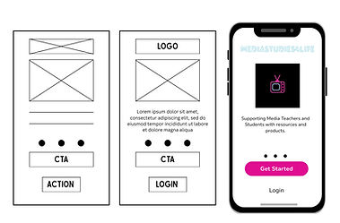
A WIREFRAME
DEFINITION:
A wireframe is a basic outline or skeleton of a media product that shows the structure and layout without detailed images, colours, or final text. It focuses on how content is arranged and how users will navigate, rather than on the finished design. Think of it as a "blueprint".
THE PURPOSE IS TO:
-
Plan the structure and organisation of the product.
-
Focus on usability and navigation before adding style.
-
Save time by solving layout problems early.
KEY FEATURES:
-
Websites → homepage, menus, content blocks, sidebars, footers.
-
Apps → screen layouts, buttons, icons and navigation flow.
-
Digital magazines/e-books → placement of text, images and interactive elements.
-
Online Adverts → positioning of text, image, and call-to-action buttons.
-
Interactive media (e.g., games, online platforms) → basic structure of screens or levels before visuals are added.

FIDELITY
DEFINITION:
In media production, fidelity describes how detailed and realistic a draft, prototype, or design is.
-
Low fidelity → simple, rough, and quick. Focuses on basic layout and ideas (like sketches, stick figures, or plain boxes).
-
High fidelity → detailed, polished, and close to the final product. Includes real images, fonts, colours, and interactive features.
Think of it as the difference between a rough sketch and a finished poster.
THE PURPOSE IS TO:
-
Low fidelity → save time, test early ideas and get feedback before committing effort.
-
High fidelity → show exactly how the final product will look and function, ready for testing or approval.
KEY FEATURES:
-
Low fidelity examples: hand-drawn wireframes, rough mock-ups, storyboards with stick figures, draft edits with placeholder text or images.
-
High fidelity examples: polished magazine spreads with chosen fonts/images, a near-complete website design, a professional poster draft, a video edit with transitions and sound.
THE RULE OF THIRDS
DEFINITION:
The Rule of Thirds is a composition technique where the frame is divided into nine equal sections using two vertical and two horizontal lines. Important elements in a shot are placed along these lines or at the points where the lines intersect. This helps create a more visually balanced and engaging image.
THE PURPOSE IT TO:
-
Guide the audience’s attention to important parts of the image.
-
Create a balanced composition (not too empty, not too crowded).
-
Make shots look more professional and cinematic.
-
Help the audience know where to look without thinking.
KEY FEATURES:
Focal Points (Intersections)
-
The four points where lines meet are called power points.
-
Important subjects are often placed here.
Example: A character’s eyes positioned on a top intersection.
Horizontal Lines
-
Used for horizons or eye lines.
-
Usually placed on the top third or bottom third, not the centre.
Vertical Lines
-
Used to position subjects off-centre.
-
Leaves space for: Movement and Looking room (where a character is facing).
Creates “Looking Space”
-
If a character looks left, place them on the right third.
-
This leaves space in front of them.
-
Makes the shot feel natural and less cramped.
.png)
DESIGN HIERARCHY
DEFINITION:
Design hierarchy is the way designers organise elements so the viewer knows what to look at first, second, and third.
PURPOSE:
-
It helps control where the eye goes, what feels most important and how information is understood quickly
KEY FEATURES
-
Size: Bigger things grab attention first. Headlines are larger than body text because they are more important.
-
Colour: Bright or bold colours stand out more than dull or muted ones.
-
Position: Elements placed at the top or centre usually get noticed first.
-
Contrast: A light object on a dark background (or vice versa) stands out.
-
Font Choice: Bold, capital letters or unusual fonts can draw attention.
-
Spacing: Leaving space around something makes it feel more important.
.png)
What to Include in your Technical Review and Record
WHAT DID YOU DO?
Think about what you wanted to achieve during the production stage and the post-production (editing) stage to create your production.
HOW DID YOU DO IT?
Be very specific here with the step by step of what you did, what techniques and tools you used to create the shot, the scene, the effect in the editing suite. How did you refine your idea? Remember to take photos of how you set things up or take screenshots of the tools and techniques you use when editing.
HOW SUCCESSFUL WAS IT?
What has gone well? How does it meet the requirements of the brief? What could be improved?
KEY TIPS
-
Use media terminology throughout such as long shots, costume, non-diegetic, fast paced editing, non-linear narrative, conventions.
-
Consider the audience and the impact you wanted your media production to have on them
SENTENCE STARTERS
-
I chose to use… because…
-
This was effective because…
-
This created the effect of…
-
This made the audience feel…
-
However, a limitation was…
-
To improve this, I would…


